The One Million Logo
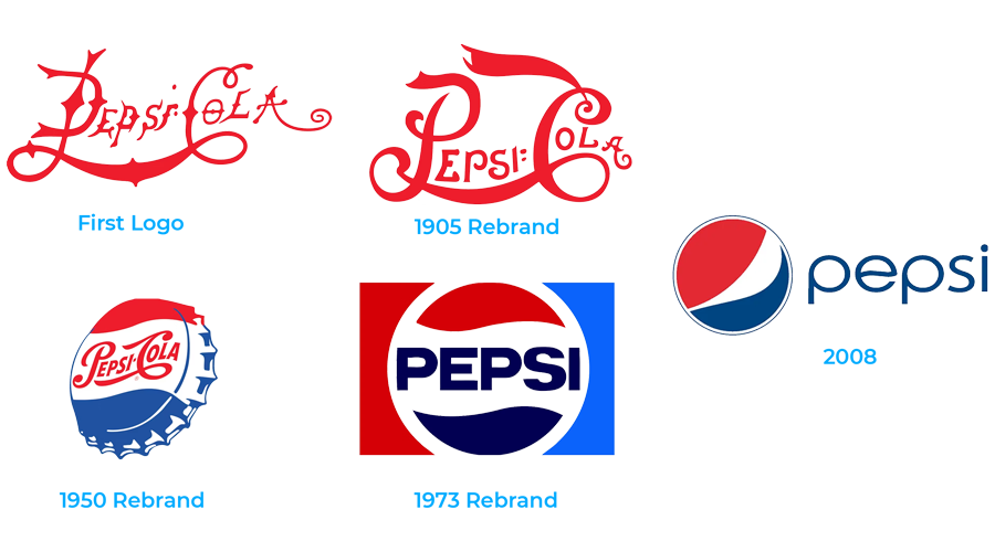
In 2008, Pepsi rebranded its logo. The company reportedly paid one million for its new logo. Pepsi’s logo has evolved at least a dozen times since its first one in 1898. The 2008 Pepsi logo redesign provides us a blueprint to understanding how branding design is approached by established advertising agencies.

A 27-page document purported to have been the design document behind the Pepsi redesign reportedly shows the steps taken by the Arnell Group in redesigning Pepsi’s logo for 2008. Although there is controversy over the authenticity of the design document, it, nonetheless, is useful to understanding the design process and why traditional advertising agencies start their fees for logo design around $3,000.
The so-called “breathtaking” document argued that the new logo was moving Pepsi’s brand “towards innovation” by “projecting Pepsi’s future” with the rebrand. The document outlines several steps used to understanding the history of the company and its culture, labeled DNA in the document, to arrive at a brand that would take the company towards future growth. The document is filled with advertising jargon and theory of imagery. Words like golden ratios, magnetic fields and fengshui are necessary to justify the high cost of advertising. But are they necessary? Not in most cases, although an iconic company like Pepsi likely needed to be convinced to update their logo at over one million dollars, not to mention the cost of repackaging, labeling and rebranding all their buildings and vehicles, to mention a few.
The document likely is not representative of how most advertising agencies document their marketing strategies but it outlines what steps most take towards developing a brand, albeit not as complicated as the document suggests.
As much work and expense that went into the 2008 rebranding of Pepsi it was not without its controversy. Logos evoke emotion. That is their function. It is hoped that a logo evokes a positive emotion, but because a logo targets emotion the response is not always positive. In the case of the 2008 Pepsi logo rebranding, it led to some knocking it for looking too much like Barack Obama’s iconic presidential campaign logo.

